Around the world COVID-19 infection rates have increased significantly since we first introduced our infection risk maps due to improvements in mass testing, and the increased transmissibility of the disease because of new strains.
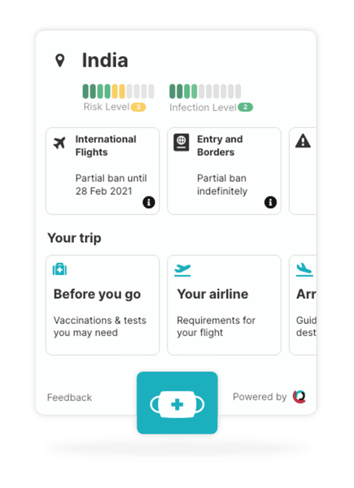
To reflect this change we have updated the infection risk levels and their corresponding colours on our COVID-19 maps. We now have eight different COVID-19 infection risk levels and colours, ranging from Low (0 infections per 100,000) shown as a dark green to Extreme +++ (960 plus infections per 100,000) shown as a dark purple. These levels are in line with current European CDC levels of infection tracking.
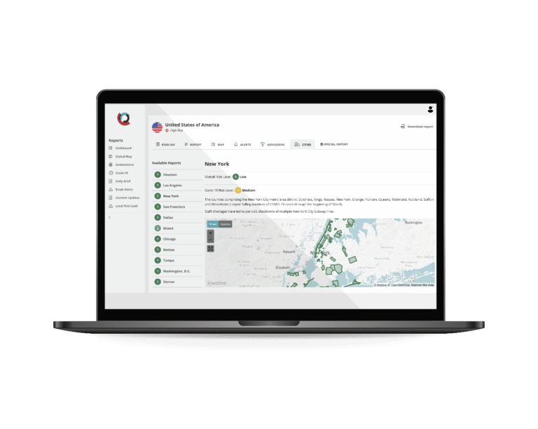
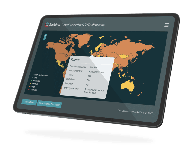
For our global COVID-19 map, each country’s infection risk level is based on the number of new infections in the past fourteen days per 100,000 people. This data is sourced from the European CDC.
For our domestic COVID-19 maps, each sub-national entity’s infection risk level is based on the number of new infections in the past seven days per 100,000 people. This data is sourced from John Hopkins University for the USA and Australia; Canadian Public Health; the French government; and the Spanish government.
This new update to our COVID-19 microsite is part of our ongoing and evolving coverage of the pandemic to keep up with rapidly changing health, security and travel environments around the world.
If you’re not currently receiving Riskline’s travel risk intelligence solutions and would like to gain access to our dedicated COVID-19 microsite, you can click this link to subscribe to the hub on a simple monthly plan of €175/month.
We also offer free, interactive COVID-19 global and regional maps that can be embedded on any website or platform via our public tools website.